
Italian Regional Flags Redesign

The 20 Regions of Italy
The intent of this was just for fun, but if I was to be sincere about it, I would say that a number of Italy’s regional flags are in need of a design make-over (I’m looking at you, Sardinia!). Regional pride is still taken quite seriously in Italy, something not as overly profound in Canada’s provincial sphere -- except maybe in Quebec. In fact, there is an Italian word for this sense of regionalism: ‘campanilismo’, from the word ‘campanile’ meaning bell tower. The bell tower of churches in many Italian cities and towns is considered a symbolic and physical significance to the focus of the local area.
My approach was to create or use existing geometric forms, colours and/or images that might have existed since medie- val anitiquity, but could have easly been created by graphic designers today. The flag of Denmark, for example, has been in existance since the 12th Century, making it the worlds oldest flag in current use, and yet (if I didn’t know better) it could have been made yesterday: it is two crossed white lines on a red background -- couldn’t be any more simple! Flag design, it would seem, is a perfect blend of the traditional and the modern.
In some approachments, especially those with a shield, the answer was staring right at you: just take the design from that shield and expand it (I know that sounds lazy, but there were twenty flags to go through! In any case, it still kept the some of the history and meaning to the region in question). In other cases, I had to research the region and come up with some- thing original.
Personally, I believe there is nothing wrong with having certain regional quirks -- if anything, they add diversity and char- acter to the country as a whole. It is the politics and seperatist sentiment that can give regionalism a bad name. Traditional art, music, attire, language, sports, food (especially food), are what make me want to explore a country even more! So, if a region can have pride in good food, then why not good design?
I have listed the regional flags in alphabetical order by their Italian name. On the left side is the original, on the right is the redesign.

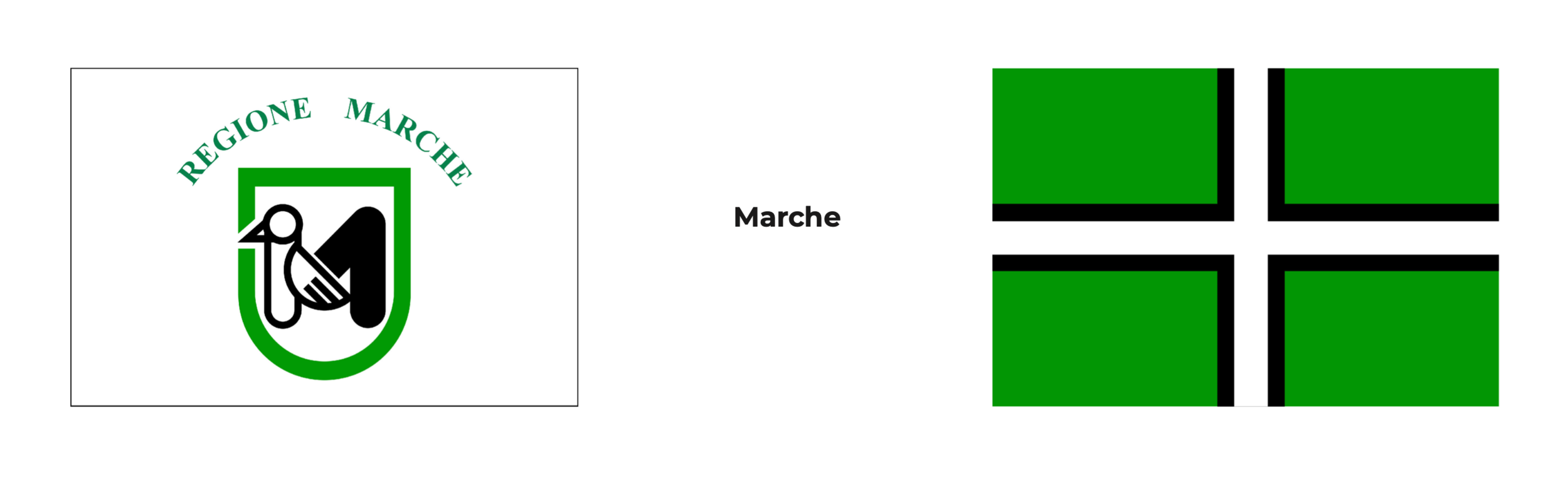
This was one of the easy ones: I took the coat of arms and made it the flag itself.
The white represents the snow-capped mountains, green represents the hills, and blue represents the Adriatic Sea.
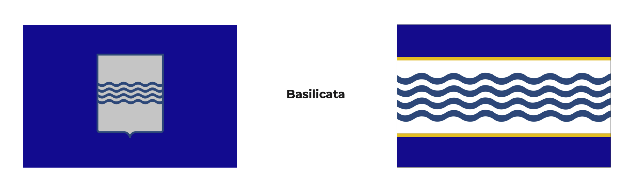
Same approach to the previous one. The original image used here from the Wikipedia page is inaccerate in the colour scheme of the coar of arms. The redesign uses the original colours as shown. The four wavy lines represent the four rivers of the region: the Agri, the Basento, the Bradano, and the Sinni.

Using the coat of arms, I kept the yellow and silver/grey (sometimes white) colours, and the the Teutonic and Byzantine crosses in the same yellow. I tried incorporating the other two elements, a pine tree and a fractured Doric colomn, but I found it made the composition too busy.

I didn’t mind the original’s overall design, as it looked simple enough (it kind of looks like an ultra-simplified version of the Alberta provincial flag). However, I thought it just needed an element or two to make it less “boring”: two more red slanted lines.
The single red band give off the impression of a ‘prohibited’ sign (i.e. ‘No Smoking’. I was tempted to incorporate the Ghostbusters icon, just for fun. Who needs a Vatican exorsist when you can call someone from Campania?). The slight change of the sheild’s shape was a personal preference. I am not as keen on the rectangular shape that is often seen in Italian heraldry.

This one drove me crazy. I first tried the look of expanding the icon into the whole flag, but the composition seemed off-balanced, so I tried to come up with something original but still meaninful to the region.
Being one of the wealthest regions in Italy, Emilia-Romagna has a lot going for it. It is a food-lover’s paradise and is the automotive manufacturer of Ferrari and Lamborghini. These, however, are somewhat recent revelations in relation to Emilia-Romagna’s ancient past. Like the rest of the Italian pennisula, it was under the rule of various powers prior to becoming part of the Kingdom of Italy (1861).
I eventually caved in to the conventional colour-coding format: violet for the Region’s history (Roman Empire, the Paple States, antiquity in general) and yellow for prosperity. I am, however, satisfied with the result. I think the violet works because it completes the use of all three secondary colours for this collection of redesigns.

I used the eagle from the historical flag of Friuli (sans red claws) wielding a spear from the coat of arms of Tieste, the region’s capital, to indicate the region’s connection with Central Europe (notably, Slovenia).

I kept the blue field, as well as the laural and olive branches, albiet with colour changes. The crowned wolf’s head symbolizes the history of the region and its capital, Rome. Legend states that Rome’s founder, Romulus, was nurtured by a female wolf as an infant, and is the decendant of many Roman emperors.

There are two flags I see in the orginal: 1) the ship’s sail and 2) the tricolour background. I went with the sail because the I found the background, while bright and colourful, a bit hard on the eyes.
The red cross is the current flag of Genoa, Liguria’s capital, and the four stars represent the four provinces of the region.

This was another one I didn’t mind too much -- again, simple use of colour and design. However, with the emblem, it gives the impression a flower or a clover rather than the intended symbol of a prehistoric rock engraving. I was not even aware of the Camunian rose (Rosa camuna) symbol before I researched it. With the redesign, I went with something a bit more obvious: the green represents the landscape, while the silver/grey represents the region’s industrial and innovative side. At the centre is the Stella d’Italia, also found on the national coat of arms.
Taking the colours of the original design, I resorted to incorporating them into a double layered cross on a green field. Initially I played with the idea of using the European green woodpecker, a totem of the ancient Pecentes tribe, but did not find it very inspiring.

I took the shield and expanded it into the flag itself. Again, the wikipedia image has the wrong colours for the shield: red and white, not red and grey.
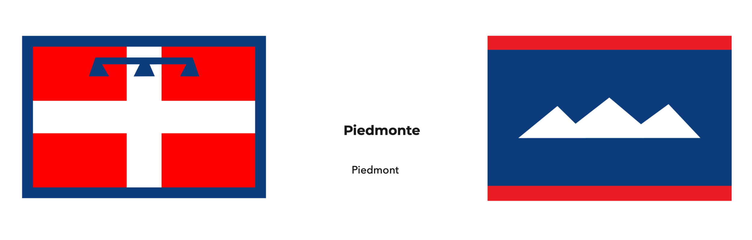
Initially, from the original, I thought of removing the heraldic label (the blue pendent at the top), as a quick fix. But research on this flag states that the label was added to distingush it from the coat of arms of the House of Savoy.
Since Piedmont means “at the foot of the mountains (the Alps)”, I decided to use a simple mountain chain emblem, while retaining the colours from the original.

The white background and olive branch symbolizes peace, as well as the olive tree being a common featurew in the countryside. Each leaf represents the six provinces in the region. The gold corners represent the sun.

Arguably the most contoversial of the regional flags (at least from a non-Sardinian/non-Italian perspective), I felt Sardnina needed a serious make-over. Going over the island’s history, I saw the Civil Flag and Ensign of the Kingdom of Sardinia (1816-1848). Just using the double cross from the Ensign, I reversed the colours--a reminder of the past while moving foward with the new.

Sicily certainly has the wierdest flag -- at least with regards to the emblem. I expirimented by using some elements from the emblem: the triskelion (the three legs) and the three stalks of wheat.
I wanted the triple legs to work, I really did. Reason being is because it has worked before: the flag of the Isle of Man (U.K.) has a triskelion of three legs, albiet clad in armor. I used the existing background as well as its colour palatte for the emblems.

When I think of Tuscany, I think of the beautiful city of Firenze (Florence), sun soaked green pastures with cyprus trees, and the scenic town of Cortona. But never a pegasus. That’s more suited for Greece. Besides, Frances Mayes’ memoir isn’t called Under the Tuscan Sun for nothing.
In place of the old emblem, I went with the old-fashioned style of the sun-with-a-face (a “sun in splendour” in heraldic terms) because it just seemed fitting and it retained that look of antiquity.

I combined the black and red eagles into a somewhat simplified single version. The bicolour field is reversed virtically to meet the split in the eagle. Like the original, the red portion of the eagle represents Alto Adige, and the black portion represents Trentino.

A note on the original flag’s emblem: the three red pillers are the three candles of the Festa dei Ceri (Saint Ubaldo Day), an event celebrated in Gubbio.
...As far as I can tell, they look more like six aircraft bombs behind a protective grate.
Fortunately, it was the Festa dei Ceri candles gave me the insightful clue. At this local festival, a procession (a race, actually) takes place in which tall, heavy wooden replicas of the candles are carried upright by a team of a dozon or so runners. Each of the candles are topped by a small statue of one of the three saints: Saint Umbaldo, Saint George and Saint Anthony. The runners for each plinth are clad in a shirt in one of the saints’ representative colours -- yellow (St.Ubaldo), blue (St.George) and black (St.Anthony).

Another simple one: I retraced the lion from the coat of arms and placed it in the center of the feild. The lion’s tongue and claws where changed in colour so it wouldn’t clash with the feild’s red portion.

I was actually a bit reluctant to redeign the flag of Veneto: it is quite a pretty flag despite it’s complex imagry. In fact, Veneto’s capital, Venice, had a similar, more elaborate version of this. Today, Venice flies a “simplified”, red and yellow replica of the Banner of Saint Mark, as it is also known, and is sometimes flown throughout the rest of the region. Using the original colour scheme from that, I simplified the winged lion and the boarder’s design. I omitted the tassels tomake it more compatable with the rest of the redesgns.